Competitor Profile Analysis:
We studied positioning strategies, service packages, design and content of websites of accelerators, as well as startups and CEO coaches in the United States to identify the distinctive features and competitive advantages of the brand.
Vision, Mission, Values, DNA:
Created a brand name. “Destination” is a reference to the philosophy of its founders: you need to clearly articulate the goal to choose the right path to achieve it and keep this goal in mind so that momentary ideas and opportunities do not lead you astray. Also, one of the founders is an avid cross-country racer and knows how valuable it is to reach the cherished finish line (destination).
We developed key brand values and a unique approach to working with clients. Based on the studied competitors’ strategies and the main “pains” of potential customers, we formed a brand mission that is not only to get to the destination (create a successful business) but also to enjoy the journey (keep inspired, avoid burnout, see opportunities, and learn from mistakes)
Logo and Brand System:
We developed a brand logo that contains map symbols: a dotted line – the path, a geo-tag – the point where you are now and the point where you want to go. This symbolism conveys the idea that the Destination Accelerator is designed to show startup CEOs the right path to their destination.
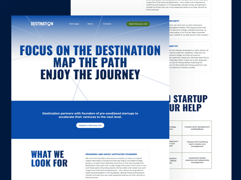
The lines on the site harmoniously fit into the overall concept, as they symbolize the routes on the maps. These lines are mostly intertwined on the website and convey the idea that the CEO of a startup has many paths they can take and it is important to choose the right one.
UI/UX Mapping & Design:
We thought over the design of the website, which advantageously differs from competitors: it does not contain stock images, as well as photos of business people and handshakes. Instead, we have chosen colors and fonts that will help the user to focus on the main messages and easily perceive the information. We have also added animation to make the first interaction more attention-grabbing and engaging for the user.

Copywriting:
Wrote content for the website from scratch, including slogan-like phrases, company description, approach, values, range of services, and information about the Destination Accelerator founders. In our texts, we avoided clichés, big words, and professional vocabulary, thanks to which they convey the main messages in a profitable way, but do not annoy the reader.
Digital Presentations:
We prepared a presentation for the CEO of startups, where we briefly outlined the main problems that the founder may face along with ways to solve and/or avoid them with the Destination Accelerator.


 We use cookies and similar technologies to enable services and functionality on our site and to understand your interaction with our service. By clicking on accept, you agree to our use of such technologies for marketing and analytics.